CMS Content Configuration
All participant-facing text, labels, and content in GLHF are managed through the Strapi admin panel — not hardcoded. This page documents every configurable field, organized by content type.
Global Single Type
Strapi path: Content Manager → Global
The Global single type controls site-wide settings and layout. All fields support i18n localization.
| Field | Type | Required | Description |
|---|---|---|---|
studyName | string | yes | Participant-facing study name (e.g., "GamePlay.Study"). Used in emails, footer, and survey headers. See Study Parameters for details. |
supportEmail | string | Support contact email | |
metaTitleSuffix | string | yes | Appended to all page titles for SEO |
favicon | media (image) | Site favicon | |
metadata | component (meta.metadata) | Default SEO metadata (title, description, image) | |
notificationBanner | component (elements.notification-banner) | Site-wide notification banner displayed at the top of every page | |
navbar | component (layout.navbar) | Navigation bar content (logo, links) | |
footer | component (layout.footer) | Footer content (logo, links, text) |
Login Page
Strapi path: Content Manager → Login page
The Login Page single type controls the login/sign-up page. This content type does not support i18n localization. Draft/publish is supported.
| Field | Type | Required | Description |
|---|---|---|---|
title | string | Page heading | |
description | richtext | Page description | |
metadata | component (meta.metadata) | Page SEO metadata | |
FAQ | component (sections.accordion) | FAQ accordion section | |
showLoginSection | boolean | Toggle login form visibility (default: true) | |
closeSignUp | component (elements.close-sign-up) | Sign-up capacity control (see Close Sign-Up below) |
Close Sign-Up
Component: elements.close-sign-up
Controls whether new sign-ups are accepted and what message is shown when sign-up is closed.
| Field | Type | Default | Description |
|---|---|---|---|
signUpEnabled | boolean | true | Master toggle for new sign-ups |
maxUsers | integer (min: 0) | 4000 | Maximum user cap — sign-up closes when this limit is reached |
description | text | Message shown to visitors when sign-up is closed |
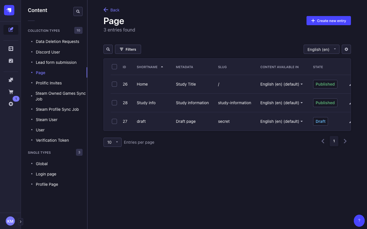
Pages
Strapi path: Content Manager → Pages
The Pages collection type holds marketing and landing pages with dynamic content sections. All content fields support i18n localization (except slug). Draft/publish is supported.
| Field | Type | Required | Localized | Description |
|---|---|---|---|---|
shortName | string | yes | Short display name | |
slug | string | no | URL path (regex: ^$|^[a-zA-Z/-]+$) | |
metadata | component (meta.metadata) | yes | yes | Page SEO metadata |
contentSections | dynamic zone | yes | Page content blocks (see Content Sections below) |
Content Sections Dynamic Zone
The contentSections dynamic zone allows study admins to build pages from the following section types:
| Component | Description |
|---|---|
sections.hero | Hero banner with title, label, description, picture, and buttons |
sections.rich-text | Rich text content block |
sections.feature-columns-group | Grid of feature columns |
sections.feature-rows-group | List of feature rows with media |
sections.team | Team member showcase |
sections.logos | Logo grid |
sections.lead-form | Lead capture form |
sections.bottom-actions | CTA buttons |
sections.large-video | Video showcase |
Pages are rendered by the frontend's catch-all route ([[...slug]].js). The slug field determines the URL path — for example, a page with slug about is available at /about.
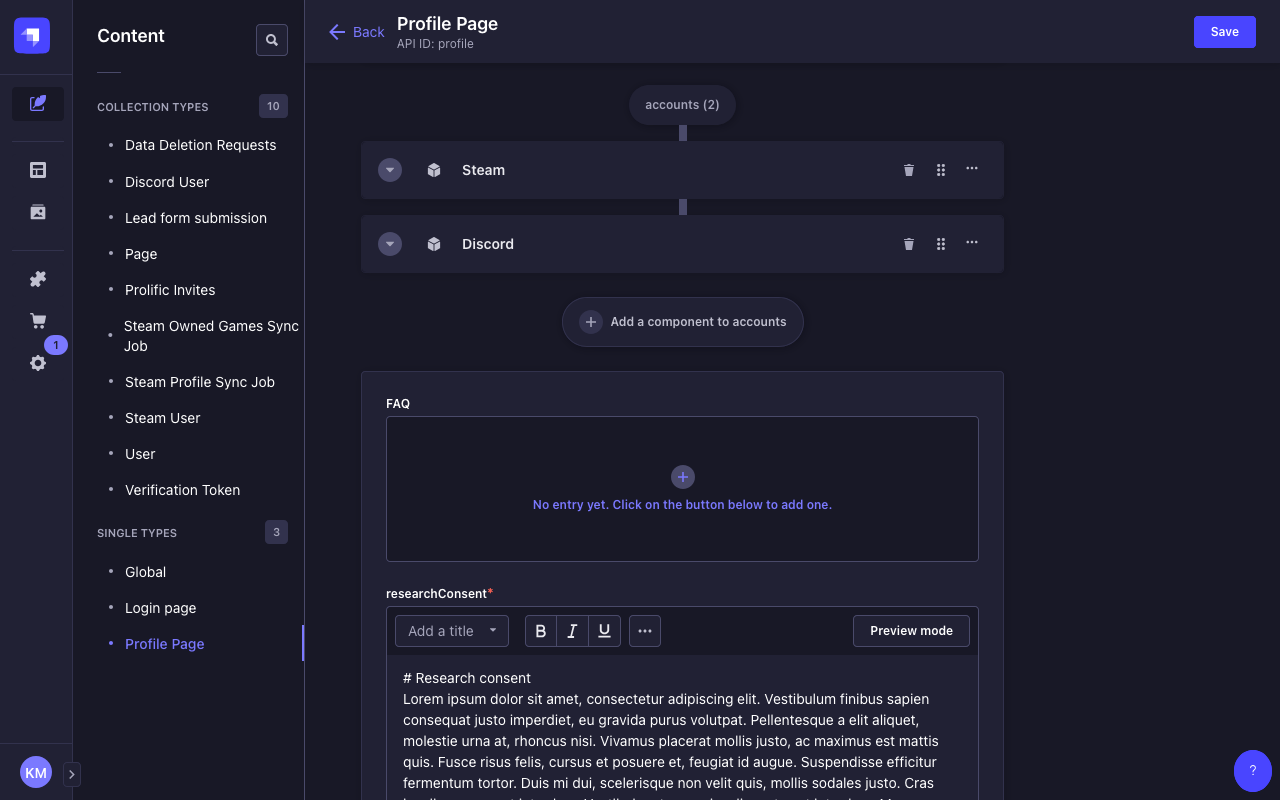
Profile Page
Strapi path: Content Manager → Profile Page
The Profile Page single type controls the participant profile page content. This content type does not support i18n localization.
| Field | Type | Required | Description |
|---|---|---|---|
title | string | Page heading | |
metadata | component (meta.metadata) | Page SEO metadata | |
researchConsent | richtext | yes | Consent text shown to participants before they can proceed |
FAQ | component (sections.accordion) | FAQ accordion section | |
accounts | dynamic zone | Integration cards (see Integration Cards below) | |
deleteAccount | component (profile.account-data) | Account data management section (see Account Data below) | |
feedback | component (profile.feedback, repeatable) | Study feedback sections per provider (see Feedback below) |
Integration Cards (accounts Dynamic Zone)
The accounts dynamic zone on the Profile Page holds integration cards for Discord and Steam. Both integrations share an identical top-level structure with three state-dependent sub-components.
Top-Level Structure
Each integration component (integrations.discord, integrations.steam) has:
| Field | Type | Description |
|---|---|---|
show | boolean | Toggle whether the integration card is visible on the profile page |
notConnected | component | Content shown when the account is not linked |
connectedSuccess | component | Content shown after successful linking |
connectedFail | component | Content shown when linking fails or requirements aren't met |
notConnected State
Displayed when the participant hasn't linked the account.
| Field | Type | Description |
|---|---|---|
titleNotConnected | string | Heading text |
descriptionNotConnected | text | Explanation shown below the heading |
buttonLabelNotConnected | string | CTA button label (e.g., "Link Discord", "Link Steam") |
connectedSuccess State
Displayed after the participant successfully links the account.
| Field | Type | Description |
|---|---|---|
title | string | Heading text |
chip | string | Badge label (e.g., "Connected") |
description | text | Success message |
connectedFail State
Displayed when account linking fails or requirements aren't met.
| Field | Type | Description |
|---|---|---|
title | string | Heading text |
chip | string | Badge label |
description | text | Error explanation |
Steam-Specific connectedFail Fields
The Steam connectedFail component has additional fields for privacy/requirement feedback:
| Field | Type | Description |
|---|---|---|
feedbackFoundOwnedGames | string | Shown when owned games check passes |
feedbackNoOwnedGames | string | Shown when no owned games are found |
feedbackHasPlaytimePublic | string | Shown when playtime is publicly visible |
feedbackHasPlaytimePrivate | string | Shown when playtime is private |
feedbackFoundRecentlyPlayedGames | string | Shown when recent playtime exists |
feedbackNoRecentlyPlayedGames | string | Shown when no recent playtime exists |
buttonLabelRecheck | string | Label for the "recheck" button after settings change |
The show toggle controls visibility only. Whether an integration is actually required for study activation is controlled by the DISCORD_REQUIRED and STEAM_REQUIRED environment variables.
Account Data
Component: profile.account-data
Controls the account data management section on the profile page (withdraw from study, delete data).
| Field | Type | Description |
|---|---|---|
header | string | Section heading |
withdrawHeader | string | Withdraw sub-section heading |
withdrawDescription | richtext | Explanation of what withdrawing means |
withdrawButtonLabel | string | Withdraw button label |
deleteDataHeader | string | Delete data sub-section heading |
deleteDataDescription | richtext | Explanation of what data deletion means |
deleteDataButtonLabel | string | Delete data button label |
deleteDataModalHeader | string | Confirmation modal heading |
deleteDataModal | richtext | Confirmation modal body text |
deleteDataModalButtonCancelLabel | string | Modal cancel button label |
deleteDataModalButtonDeleteLabel | string | Modal confirm-delete button label |
Feedback
Component: profile.feedback (repeatable)
Each feedback entry corresponds to a recruitment provider and displays state-dependent content based on where the participant is in the study lifecycle.
| Field | Type | Description |
|---|---|---|
provider | enum: prolific, public, qualtrics | Which recruitment channel this feedback block applies to |
notLinked | richtext | Shown when required accounts are not yet linked |
linkedNotActive | richtext | Shown when accounts are linked but study hasn't started |
active | richtext | Shown during active data collection |
surveySent | richtext | Shown after the survey has been sent |
studyCompleted | richtext | Shown after the study is complete |
progress | component (profile.progress) | Progress tracker steps (see below) |
Progress Component
Component: profile.progress
Configures the step-by-step progress indicator shown to participants.
| Field | Type | Default | Description |
|---|---|---|---|
showLinkStep | boolean (required) | true | Show the "link accounts" step |
linkStepCompletedLabel | richtext | Label when link step is complete | |
linkStepNotCompletedLabel | richtext | Label when link step is not complete | |
showCheckPrivacyStep | boolean | Show the "check privacy settings" step | |
checkPrivacyStepCompletedLabel | richtext | Label when privacy check passes | |
checkPrivacyStepNotCompletedLabel | richtext | Label when privacy check fails | |
showSurveyStep | boolean | Show the "complete survey" step | |
surveyStepCompletedLabel | richtext | Label when survey is complete | |
surveyStepNotCompletedLabel | richtext | Label when survey is pending | |
showStudyCompletedStep | boolean | Show the "study completed" step | |
studyCompletedLabel | richtext | Label for the completed state |